My intention is not to degrade the great Photoshop, I just want to tell you why you should use it only for image manipulation and not for brochures or any other print design.
Let us face it, Photoshop is a great tool and it is the one of the first software kids are learning today. They download it from torrents and then play with it. By the way, have you wander why Adobe’s software protection is the same for ages? Well, it is nice when you have army of kids that know to use your software and they will grow up. That is good, because Adobe without Torrents would not exists.
Moreover, all of that makes Photoshop a very handy tool for creating graphics. Here comes the „but“… However, Photoshop is not always the luckiest solution, especially for larger projects.
From a printing perspective
Photoshop can be very similar to other programs when it comes to delivering printing files. It can save your PSD file as PDF including text, shapes and other vectors. If you set it right it can even easily preserve all color numbers.
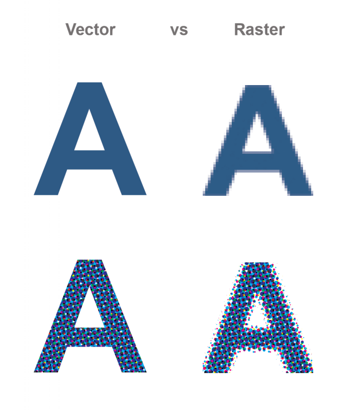
Why is it important to save vector data? Well you need to know that printing technology converts any graphic into raster graphic at the end. It is called RIP (Raster Image Processing). All data in print file is collected, calculated and then converted to one huge bitmap. So what, you have set your files at 300 dpi, why would you care? Because the line art and text RIP is rendering sometimes even at 2400 dpi, due to significant loss while printing. Imagine what quality loss would be if your text is 300dpi.

A representation of vector vs raster object, both on screen and on printed material.
Another reason for outputting shapes and text as vector is color registration. If you output text as raster image, due to several color checks and conversions it is easy to make your text contain of more than one color (black for example). Vector shapes can also undergo this kind of mistake, but less likely, due to various tools that recognize vectors and text and can bypass color manipulation. The end result of this mistake can be bad registration because text elements are very small and cannot be accurately reproduced if they contain more than one color.
No multipage
Even if you are doing one page, like advertising or flyer, you should consider some more serious program for printing design than illustrator, but if you are doing something that has more pages, you should definitely let go Photoshop. It is almost impossible to make a multi-page product and to make it look good.
One “hack” way is to produce your pages separately and then use some PDF tools (Acrobat Pro for example) to merge them into one multi-page product.
Along with InDesign, which is a multi-page champion, there is Adobe Illustrator, which can produce documents with more pages. I am using this Illustrator option very often. Just imagine how nice when you can change color to all pages across the document is.
Lack of Bleed area

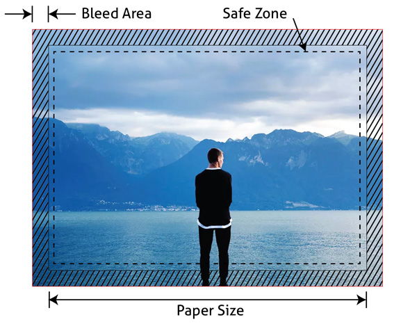
Bleed area is the area outside of document that act as a reserved “just in case” space. When a print worker cutting of your product out of big sheet, he needs to have that extra space so even if the cutting tool is missing the cutting mark you should not notice it on the final product. In Photoshop, you can simulate this space by adding guides that will simulate bleed space. However, in the case you need to make it smaller you need to do that manually, page by page.
Difficult positioning of elements
It is hard; trust me, really hard to easily position elements that requires lot of precision. Programs for vector graphics like Illustrator or InDesign have much better tools for positioning, aligning and duplicating.
Absence of Master Pages
Master pages are one of the most useful options on InDesign. Even Illustrator falling back with this. Master pages are the unique way of controlling default page content. Their usage is very important. For example, if you decide to change running header position in Photoshop, you need to open all documents and to change it. Using master pages, you can very easily manipulate with default content on your pages. Moreover, you can have many master pages applied to different pages.
No Linked Text Boxes
Linked files are a great way to make your file light as possible and to process it much easier. Also, you can open and edit files without even opening main file. Photoshop and Illustrator both have some kind of linked files but InDesign is again the winner when it comes to linked files. It can even collect them across your computer (from the place you linked them) and collect them into single folder.
Crippled typographic tools (baseline grid)
Let’s face it. Photoshop has awful typographic tools. Anyone who knows how InDesign is handling text can confirm that text setting in Photoshop is just nightmare. Absence of baseline, linked text boxes, and text reflow. You can get around this by utilizing smart objects, but it is just getting around not real deal.
No table support
No table support?! Should I say more?
A few, hopefully wise, words (Advice)
As I mention at the beginning of this article, Photoshop is a great tool, really is, but only for image processing and manipulation. If you want to do some print design, please, I beg you, learn Illustrator and InDesign. It is easy. They are very similar, so you can learn fast.
In the next blog I will show you what is the best workflow when designing for print with Adobe software.
I am excited to hear comments from you. What do you think about using Adobe Photoshop for print design? Is it a big no-no or…?
Zarko, Zak Jovic
I am a designer, M.Sc graphic engineer, visual developer and the man behind Themzy.com. Experience in many difficult tasks. Had worked mostly with offset, flexo, silk-screen, and digital printing techniques. Great knowledge allows me the high level of consulting services. Specialties: Graphic design, branding, new product line development, business visual development.